Effective Data Communications Strategies
Abstract
Collecting and analyzing data is a crucial step in making data available for campus data users, but successfully communicating data with users is equally important. Over the years, MIRO has explored how to be better forward-thinkers and active communicators and developed different strategies to communicate data effectively with different audiences.
Introduction
When Yang Zhang, Ph.D, first became MIRO’s Director in 2012, she noticed some major challenges for data users at the University of Hawaiʻi at Mānoa. People struggled with where to find the data, how to get data in a timely manner, and what data to choose from since there were different data sources and reports. It was clear that MIRO needed to build a centralized platform for people to efficiently access standardized data catered to their diverse needs.
In order to do that, the MIRO team first created a robust data warehouse to store and standardize data used for reporting. To this day, MIRO’s database continues to expand with data coming from the University’s databases, various campus offices, and the surveys administered. The process of collecting and preparing data is like mining gold on a remote island: we can dig as much gold as possible, but without efficient and meaningful means of delivering the information into users’ hands, the data we harvested would not be useful.

(Corresponding Video Here)
Deploying data and analytics is a difficult challenge, especially when users have different levels of data fluency and purposes of retrieving information. We want to encourage institutional researchers to be proactive in creating multiple avenues to effectively communicate data and where effective communication strategies come into play.
Communicating information relies heavily on whether institutional researchers can provide clear, intuitive, and engaging user experiences; that’s why MIRO always prioritizes user experience when designing and providing services to campus data users. The concept of user experience (UX) is very popular amongst high tech companies and other business sectors, and it is a process that design teams use when creating products so they can provide meaningful and relevant experiences to users. It involves both acquiring the product and integrating it into society as well as incorporating other aspects such as branding, design, usability, and function.

(Corresponding Video Here)
In the context of institutional research, MIRO defines “user experience” as the interaction between the data service the office provides and those who use it. It’s important for users to have the most positive experience so they feel engaged and stay interested in using MIRO’s services and products–this is the guiding principle of each data communication strategy. Just like any work of art, it takes time to develop effective strategies to communicate rich data with diverse audiences.
Know Your Key Users (Strategy 1)
In order to enhance the user experience, we first need to know who our users are. Data users for institutional researchers can be classified into two groups who have very different data needs: the general public and university decision makers. The general public includes all the internal and external constituents, such as faculty and staff, students (both applicants and alumni), donors, the media, government, and more. They often want to know general information about the university such as what programs are offered, how the university and its programs are accredited, demographics of the student population, and how well the university is ranked. On the other hand, university decision makers mainly include UH Mānoa faculty, staff, and administrators who need access to more data, more in depth analyses, and need to have the capacity to customize reports so they can make more data-informed decisions.

(Corresponding Video Here)
Identifying key user groups helped MIRO narrow down on what was important for different groups and prioritize the data products needing to be shared. It became very clear that it was necessary to create two different data interfaces: (1) an IR office website for general public data users to access information about the university as well as (2) an internal decision support system with interactive online data reporting tools that could provide more in-depth data and analysis to university decision makers. These two platforms are connected through a link of the decision support system on the IR office website for easy access.

(Corresponding Video Here)
The past 10 years have been a process of development and improvement where MIRO created these two interfaces for data users so that they could have easier access to data. By creating these platforms, it opened up new opportunities and gave greater autonomy to campus data users. To this day, MIRO has seen that more people are interacting with the data because of the programs the office worked so hard to establish.
Keep Things Organized (Strategy 2)
Institutional research offices manage and report large amounts of a variety of data. If people can easily find what they need without feeling overwhelmed or frustrated, they are more likely to utilize data the IR office provides. Hence, it’s extremely important for IR offices to organize data and information well so that data users can easily navigate through the centralized data platforms and locate data they need.
When building the new office website, the MIRO team studied over sixty different institutional research offices’ websites, took notes on what favorite features and used them to inspire the new MIRO website. After an eight-month process of planning, designing, and developing a new website, the ending product was a clean and compact interface, providing access to a full range of content that could address the general public’s data inquiries.
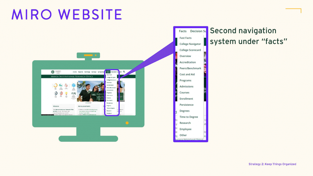
The first main navigational system is at the top of the page (see Figure 5). This includes Reports, Rankings, Surveys, Symposium, Facts, and Decision Support–all of which are higher levels of classifications for the different types of work & reports MIRO does.

(Corresponding Video Here)
The second navigation system (see Figure 6) can be found under Facts, which is where visitors will find most publicly available data and information about UH Mānoa. Keeping a large amount of data in the Facts navigational system allows us to find a balance between publishing a large amount of data and keeping a simple and clean look of the office website.
(Corresponding Video Here)
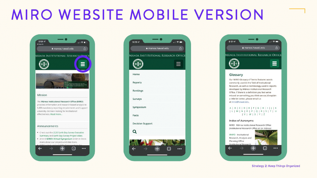
Because more and more users are accessing information through their phones and tablets, the new MIRO website was also made mobile-device-friendly. The hamburger menu allows mobile users to access these exact same features and information (see Figure 7). Faculty & staff can even customize data reports directly from their phones when they log into the interactive reports available on MIRO’s Decision Support System.
(Corresponding Video Here)
To address university decision maker’s data needs, MIRO created an internal data communication platform with dozens of web apps that allow users to retrieve data and reports themselves. UHM faculty and staff have special access to the “decision support system” through their UHM account. Decision makers often require a higher level of detail and need the capacity to conduct data mining and analytics on their own, so the predefined static reports, like the ones on the MIRO website, will not serve this need. These web apps on the decision support system are organized in ten categories: Admissions, Enrollment, Persistence, Outcomes, Courses, Comprehensive Reports, Other Reports, MIRO Surveys, NSSE Data, and NSSE Administration (see Figure 8).

(Corresponding Video Here)
Each report section contains multiple web apps that look at the same data with different perspectives. For example, under “Outcomes,” users can look at different outcome data, such as degrees, certificates, time-to-degree, and GPA. Users can also use the Degree Awarded web app to look at a specific student population’s degree data trend in the past ten years, or use the “degrees by program” web app to display and compare different programs’ degree data (see Figure 9).

(Corresponding Video Here)
Although each web app displays different data and reports, the Mānoa Institutional Research Office tries to keep the report format and filter selection consistent. For example, most web apps use the same filters that are organized in the same categories: Report Options, Academic Status, Student Demographics, Open-Ended Filters, and Academic Programs. Organizing the filters in a consistent way helps users to quickly locate the filters they need and helps them build familiarity with MIRO’s data tools as they use them more (see Figure 10).

(Corresponding Video Here)
It is challenging to provide such a great amount of data to large, diverse audiences with different levels of data knowledge. That’s why it is critical to keep the information organized and to have as simple a navigational system as possible.
Standardization and Transparency (Strategy 3)
Depending on the purpose and requirements of data reporting, the same data question may be addressed differently considering which dataset to use, which semester to look at, and what student population to include. This could cause frustration and confusion to data users, which brought about the need to create a new data communication strategy: making data methods standardized and transparent.
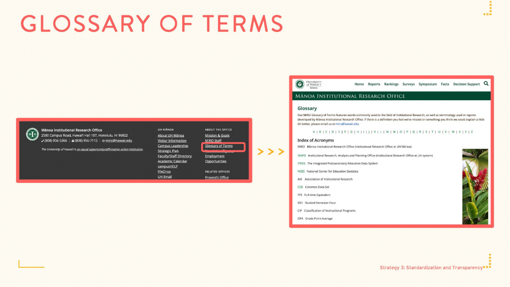
Institutional research offices need to standardize data definitions and calculations to make them as transparent as possible. One of the first things MIRO did when creating the new MIRO office website was to create a Glossary of Terms (see Figure 11).
(Corresponding Video Here)
The Federal Government’s Integrated Postsecondary Education Data System (IPEDS) and the Common Data Set (CDS) were used as the guidelines for “Glossary of Terms.” For data calculations that are not available in IPEDS and CDS, the Mānoa Institutional Research Office worked with different offices on campus to create standardized methods. To maintain transparency, definitions and calculation methods were made available in the glossary of terms and on MIRO web app’s help page. Key data elements and issues were explained in MIRO’s Analysis Briefs. In-person training and virtual symposiums were frequently hosted to further explain data issues. Just like people have different learning styles, it’s important to provide different ways to communicate data with audiences who have different preferences and data fluency levels.
IR offices often need to report data using different reporting requirements and methods which could result in different numbers. Without knowing the different reporting guidelines, data users may question the accuracy of IR’s reports when they see data discrepancy. So wherever possible, MIRO likes to include notes on data methods used so data users can understand what they see and why data is calculated in certain ways.
The web apps on MIRO’s decision support system assure that hundreds of data users and data stewards are on the same page for data reporting. When people use those data tools, they are using the same data filters and are creating reports in the same format. Additionally, when data calculation methods need to change in order to reflect changes in business rules and practices, those changes can be automatically applied to all historical data and different reports within MIRO’s programming. Data users can simply continue choosing the filters they want on their data while MIRO’s programming does the rest. Without the Decision Support System, those changes would have to be made manually: MIRO’s small staff would have to update all historical data and various reports, as well as keep everyone informed while trying to fulfill new data requests. It would prove quite challenging to maintain it all.
Easy to Digest Information and Instant Help (Strategy 4)
Most people come to institutional research offices for very basic information rather than sophisticated statistical analysis, and a majority of them do not have a background in data analysis. Designing reports and data tools in a simple and self-explanatory way will greatly improve user experience. Also, by providing sufficient and accessible assistance, it will make our reports easier to understand.
Whenever MIRO designs data platforms and web apps, great consideration goes into finding the best balance between providing the highest level of data analysis capabilities while offering clean and simple reports that are easy to read and understand.
The filters in the web apps are organized in a systematic way and are carefully selected to answer specific data questions. MIRO purposefully shows some or all of the options so users can see how data is organized and what questions can be addressed. Video tutorials help users understand how to interpret reports generated, and even have question marks next to the filters that users can click on to get more information about data included in the web apps (see Figure 12).

(Corresponding Video Here)
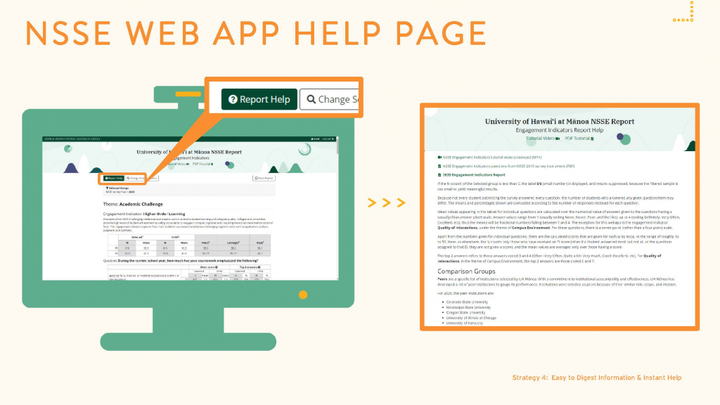
Some of MIRO’s comprehensive and survey data web apps also have help pages to further address commonly asked questions and provide more resources and background information. For example, there are a dozen different web apps to display data from the National Survey of Student Engagement (NSSE). Each NSSE web app has a help page with an explanation of survey scales & data calculations, how comparison groups were selected, and links to both the survey instrument and the report prepared by NSSE itself (see Figure 13). By having this help page, data users’ most-commonly asked questions can be addressed right away while using these data tools. This greatly improves the user’s experience so they can receive instant help, and it saves time so MIRO’s staff doesn’t have to repeatedly answer those common questions.
(Corresponding Video Here)
Other help pages, such as the one on the program review web app, also provide detailed documentation including how each data element is defined and calculated, as well as links to related web apps where users can explore for more data of their interests (see Figure 14).

(Corresponding Video Here)
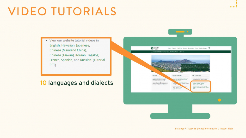
Knowing that some users would love to see videos to help them understand data or navigate the data platforms, MIRO made great efforts to create dozens of video tutorials and presentations for people to view when they need it. To help website visitors from all over the world easily navigate through the large variety and amount of information available, MIRO’s website video tutorials are prepared in ten languages and dialects (see Figure 15). This also demonstrates the great cultural diversity and linguistic resources that UH Mānoa offers; each video was made with support from UHM faculty, staff, and students.
(Corresponding Video Here)
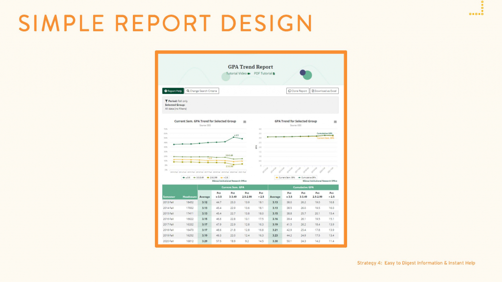
Although it’s always tempting to include as much information as possible so that one report can answer multiple questions, it’s important to be aware that too much data can overwhelm users and distract them from key data we want to communicate with them. The design of MIRO’s web app reports are purposefully simple. For example, when creating the GPA web app, we wanted the data to show historical trends of students’ current semester GPA and cumulative GPA, so that is what the graphs focus on (see Figure 16). MIRO also recognized that people often want to know the average GPA of certain student populations and the percent of students who receive different GPA levels. That data is often affected by the sample size of students included in the calculation, so all that information was included in the tables as well. While this report includes a lot of data, the design is simple and not overwhelming to data users. But what happens if it is hard to fit all the information in one report? MIRO either creates a separate web app, or allows users to see different reports on one web app.
(Corresponding Video Here)
When it comes to degrees awarded stats, most people want to see numbers broken down by different types of degrees. So, on the degree web app, the default main report format breaks down data by different types of degrees, such as bachelors, master’s, and doctoral degrees (see Figure 17).

(Corresponding Video Here)
However, many people also want to know more details such as the average student semester hours (SSH) and average GPA earned upon graduation. To avoid listing too much information on one report, MIRO created a feature in the “report options” to allow people to select the degree or degree type they desire and retrieve more-specific information (see Figure 18).

(Corresponding Video Here)
The Degree web app shows the historical degree information for a selected student population, but what if people want to see degree data from multiple programs in one report? It’s not possible to fit that information in the same web app, so a new web app was created called “Degrees by Program” that allows users to easily sort and display all programs in the department, college, or university on one report (see Figure 19).

(Corresponding Video Here)
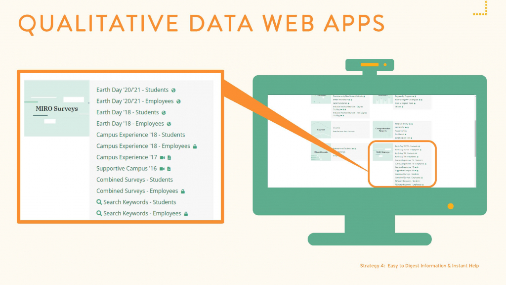
MIRO truly values what students and employees think because we believe qualitative data is meaningful, actionable, and can bring about real change. There’s a series of web apps within the decision support system to help organize and display individual’s comments related to different offices and issues (see Figure 20).
(Corresponding Video Here)
The MIRO staff identified thousands of keywords mentioned in the qualitative data they collected and used the terms to create a theme-and-indicator table. Users can click on a theme or an indicator that focuses on a specific issue to review relevant comments and statistics (see Figure 21).

(Corresponding Video Here)
From there, users can read all relevant comments about the same issue, they can see the percentage of survey respondents mentioning this issue, and can even see a bigger picture of the issue by reviewing the WordCloud image graph (see Figure 22). MIRO’s qualitative data tools took complicated, randomized, open-ended survey results and organized them into easily digestible information for campus decision makers. Ultimately, it’s important to keep things simple and digestible in order to effectively communicate data so that users with different fluency levels understand.

(Corresponding Video Here)
Branding, Marketing, and the Power of Visuals (Strategy 5)
To attract data users’ attention and spark their interests in using data, MIRO needed to work on branding and marketing from the get go. One of the first branding efforts made was to create a logo for the IR office (see Figure 23).

(Corresponding Video Here)
The logo was designed with a global image and accented with the university’s iconic green color, which represents Mānoa’s luscious green valley. The logo reflects MIRO’s goal of becoming a credible agency across the globe and for the world to get to know the University of Hawai‘i at Mānoa through data. This image is repeatedly used as a stamp in MIRO’s reports and presentations, constantly building the office brand within and beyond the institution. But creating a logo isn’t the only thing MIRO has done; MIRO consistently produces reports, presentations, web pages, and web apps with visually appealing designs. Having consistent graphic designs creates a pleasant user experience, and a more pleasant experience could also encourage users to continue using MIRO’s services. It also helps users associate MIRO’s products with the office so that, over time, people will establish familiarity with and trust in MIRO’s services.
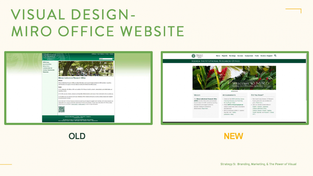
With the power of visuals and design, MIRO transformed the old office website into something more vibrant and visually appealing. While the old website is simple, the redesign is organized in a way that displays more data and reports while maintaining the same simplicity (see Figure 24).
(Corresponding Video Here)
Working with a graphic designer has helped the Mānoa Institutional Research Office maintain a professional image not only on the website designed for the general public users, but on the internal decision support system for university decision makers as well. The original design for the Decision Support System was simple and straightforward, but the newer design is visually compelling, practically inviting users to come back for more (see Figure 25). The professionalism of the new design also shows that we care about the content of our data, which helps boost the credibility of MIRO’s work.

(Corresponding Video Here)
Also found on MIRO’s website, the Fast Facts document is a collaboration between MIRO and the admission’s office. The infographics make student characteristics data look much more interesting and visually appealing (see Figure 26).
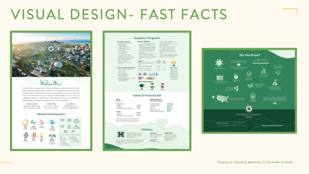
(Corresponding Video Here)
The same information in an IR report can look more professional by adding more interesting designs, as shown in MIRO’s 2020 Earth Day Survey Executive Report (see Figure 27).

(Corresponding Video Here)
Carefully designed graphics can easily convey complex ideas such as MIRO’s NSSE survey administration’s marketing plan. MIRO created a timeline image that visualizes key initiatives, colorfully organized in different time periods (see Figure 28).
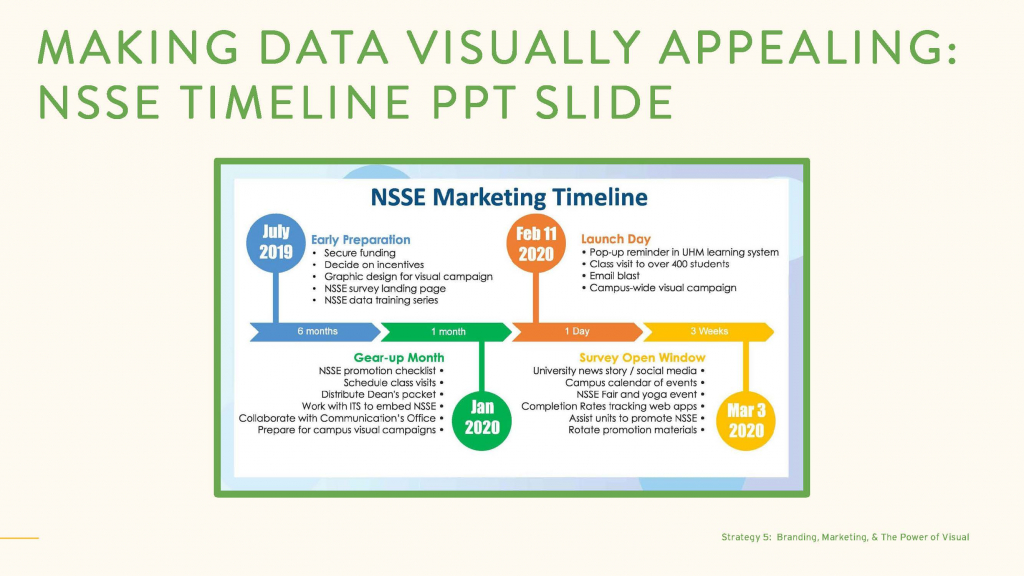
(Corresponding Video Here)
Some might say MIRO is lucky to have the budget to hire a professional graphic designer, but the office can only support a student to work 6-8 hours a week due to limited funding resources. When hiring student designers, there is a meticulous application process and the candidates’ talents are truly impressive. Each graphic designer has played an important role with MIRO’s team.
Data Dissemination
Now that there are appealing visuals, how can IR pass the information to data users so they can use the reports and tools created? Relying on word of mouth to get people’s attention is helpful but not enough. IR offices also need to make intentional marketing efforts. The avenues MIRO uses the most are monthly newsletters and virtual symposium series. The newsletter helps to inform and engage people with the IR office’s reports, service, and events; while the symposiums help to further engage audiences, both within and outside of UHM, in our key initiatives to empower higher education decision makers with reliable and easy-to-access data. The branding and design work play an important role in executing MIRO’s marketing campaigns as we creatively intertwine MIRO’s office logo and theme color in both our newsletters and symposium pages (see Figure 29).

(Corresponding Video Here)
MIRO also converted one-time projects into programs that can bring long-term marketing effect. For example, after conducting live, virtual symposiums, MIRO created symposium video recordings and a podcast program to attract new audiences while continuing to serve current data users.

(Corresponding Video Here)
Another effective way to market an IR office is by presenting at regional, national, and international conferences, which are great avenues to share an IR office’s work and practices. During the three years when the Association of Institutional Research ran a digital pass program, they only recorded a small number of conference presentations and MIRO’s presentations were always included.

(Corresponding Video Here)
The UH communication’s office is an important collaborator with MIRO to publish news stories on rankings and key data findings. MIRO’s website is often listed at the end of each ranking news story as the source of the information, which directs many new visitors to the office. MIRO also works with credible organizations to share work with a broader audience. For example, NSSE included MIRO’s survey administration and data dissemination work in its publication of “Lessons from the Field–Volume 4: Digging Deeper to Focus and Extend Data Use” (NSSE, 2017), which was sent to thousands of institutions across the United States.

(Corresponding Video Here)
How an IR office brands its services and how they determine what tools to use can make or break the user experience, so MIRO incorporated visual and audio materials to attract people’s attention and encourage them to visit the data platforms and utilize MIRO’s services.
Involve Data Users (Strategy 6)
At the end of the day, the Mānoa Institutional Research Office wants to produce data that makes sense to our data users and create tools that they find helpful and easy to use. Only when that is achieved can users continue to respond to an IR office’s data communication efforts. The last data communication strategy is dedicated to involving data users and getting their feedback throughout different stages of data preparation, research design, data tool development, and report building.
Involving data users throughout the programming process can effectively improve the capacity of assisting users in the future because they often give us ideas on how to create new reports and adjust existing programs. When developing a new data calculation method or preparing for a new report, MIRO likes to visit different offices on campus to get their feedback. When designing survey instruments or creating data visualization tools, it’s helpful to involve colleagues who have the field knowledge to learn about what works and what doesn’t in order to make necessary changes. Involving the users is the most critical in making sure that IR is able to deliver their work in the most meaningful and helpful ways.
Closing Remarks
In order to effectively communicate data with internal and external audiences, IR offices need to clearly identify their key data users and tailor data platforms to their needs. These efforts can include organizing information to help people easily locate their desired information, standardizing data calculations, improving data transparency, providing easily digestible reports and convenient support for common questions, and enhancing branding and marketing to inform more people of data and services that the IR office provides. Last but not least, involving data users throughout the data preparation and reporting process is the key to improving IR services that best address data users’ needs.


